Topic Modeling
Goals: Name topics; View topic visualizations; Add a topic graph to essay
Estimated Time to Complete: 30 minutes
In this lesson, we’ll learn how to visualize topics in our 20th-century State of the Union Address and Party Platform corpora.
Step 1. Navigate to your project repository
- Log in to GitHub (https://github.com).
- Once you’re logged in, select the dropdown arrow in the very top-right corner of your browser window. Once you select this, a dropdown list should appear that starts with the words “Signed in as [your username].” On the dropdown, locate the link titled “Your repositories” and click on it. This will take you to your GitHub account and a list of all the repositories you’ve ever created.
- Locate the name of your project repository, and click on it. This will bring you to your project repository and website, where you can continue editing files following the steps below.
Step 2. Open your website in a new browser tab or window
- In the “About” section of your repository homepage (the section to the right of the green “Code” button), locate the URL for your project site. Right click this URL and select either “Open link in new tab” or “Open link in new window.”
- Now you should have two tabs/windows open: one with your GitHub repository (the “back end” of your site) and one with your website (the “front end” of your site). You’ll need both of these tabs/windows open for the duration of this Lab.
Step 3. Name topics
Remember our discussion of topic modeling? We’re going to apply that knowledge this week!
Your instructors prepared each of our text corpora (20th-century State of the Union texts and Party Platform texts) by uploading them into a topic modeling tool, which analyzed and clustered groupings of words based on the probability that they share a similar “theme” or “topic.” We’ve included the outputs of this analysis in this repository, for you to label and visualize.
Follow the process below to label (or “name”) some of these topics:
- Make sure your GitHub repository is still open in one browser tab/window, and your project website is still open in another tab/window.
- Navigate to the homepage of your GitHub repository by clicking on the <> Code tab above your repository files.
- Locate and click on the “_data” folder in your repository (should be near the top of your repository files).
- Once inside the “_data” folder, click on the “topics” folder.
- Inside the “topics” folder are a series of spreadsheets, each containing topics for a specified subset of documents in our corpora.
A description of each spreadsheet and its corresponding filename as it appears in the “_data” folder are listed in the table below:
| Filename | Description |
|---|---|
| party-platforms-20th-century-all-topics.csv | Party Platforms from the 20th century |
| party-platforms-20th-century-democratic-topics.csv | Democratic Party Platforms from the 20th century |
| party-platforms-20th-century-republican-topics.csv | Republican Party Platforms from the 20th century |
| sotu-20th-century-topics.csv | State of the Union Addresses from the 20th century |
Continue following these instructions to open and edit one of these files:
View Topic Spreadsheet
-
In the “topics” folder, locate the State of the Union 20th century file (
sotu-20th-century-topics.csv), and click on it. -
Take a look at the “words” and “topicname” columns in this spreadsheet. Each “words” cell contains 10 words that our topic modeling software has determined fit together in a topic, but it’s up to us to determine what that topic should be called.
-
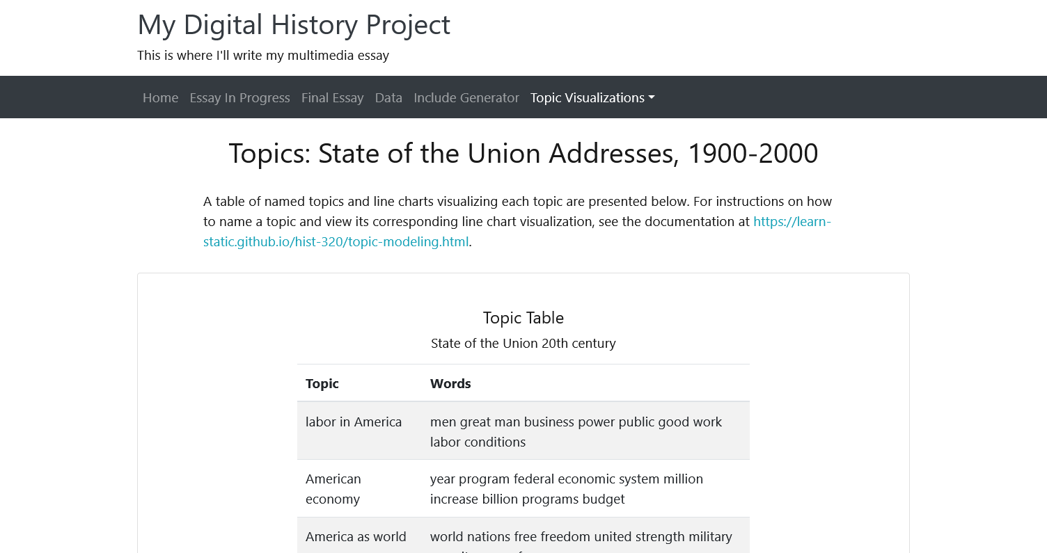
Your instructors have already named four of the topics, by adding labels for those topics to the “topicname” column: “labor in America,” “American economy,” “America as world power,” and “America at war.”
-
Now it’s your turn to name or rename some of the topics in this spreadsheet. You’re welcome to stick with the topic names your instructors picked, but if you understand those topics differently, you’re also welcome to change their names. This is an inherently subjective process! Some names for topics in this spreadsheet might seem very obvious to you, while other topics contain words that don’t seem to have any similarities at all. You don’t need to name every topic in this spreadsheet, but you should spend some time seriously thinking about them, and when you’re ready to name or rename at least three topics in this file, continue on to the next step.
-
Enter Editing Mode
-
Click on the pencil button to edit the spreadsheet of topics.
-
When you click on the pencil button, you’ll notice that the spreadsheet changes form!
-
Now, instead of the cells we typically see in a spreadsheet, each column of information is separated by commas. That’s because this is a “CSV” file (remember the file extension
.csvat the end ofsotu-20th-century-topics.csv?), and CSV stands for “comma-separated-values.” -
The very first row in this CSV contains the column titles, and looks like this:
topic,tokencount,words,topicname. Do not edit this row! The ten rows below this row are available for you to edit, following the directions laid out in the next step.
-
Edit the Spreadsheet to Name the Topics
- To name a topic, add the topic name after the very last comma in a row. For instance, the first topic in this spreadsheet is made up of the words,
law country made government service navy commerce officers proper duty. To name this topic, you’ll need to type your topic name after the comma that comes after duty, so if your topic name were “Example Topic,” it would look like this:
topic,tokencount,words,topicname
0,45231,"law country made government service navy commerce officers proper duty",Example Topic
In the example above, “Example Topic” has now been added to the “topicname” column.
If you want to replace a topic name that already exists instead of adding a new one, look for the topic name you want to edit (such as “labor in America,” or “American economy”), delete it, and add your new topic name in its place.
Make sure that you don’t delete the comma that precedes it–there should be a comma separating a topic’s words and a topic’s name.
Remember, the only thing you’ll be editing in this file are the topic names, not the words in the topics themselves.
Now that you’re in editing mode, add or edit at least three topic names, then scroll to the bottom of the page, add a commit message, and press the green “Commit changes” button to save your changes.
Proceed to the next step to discover how to visualize the topics you’ve just named.
Step 4. Visualize your topics
When we topic model a collection of texts, we not only get a set of topics (like the one we just looked at!), but we also get some data that shows how much a topic appears in a specific text.
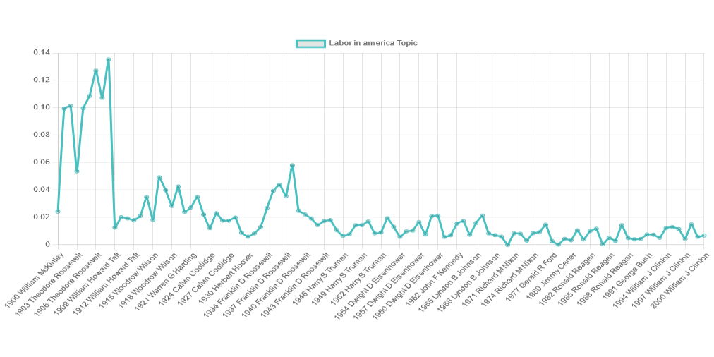
So, once we’ve determined that we think a topic should be named “labor in America,” for instance, we want to know which president talks the most about “labor in America” out of all of the 20th-century State of the Union Addresses.
This is most easily visualized using a line graph that shows a topic’s percentage in each document.
Your website will automatically generate a line graph just like this for every topic that you name:
Follow these steps to check out the graphs that were created for the topics you just named:
View Topic List
-
Navigate to your website (front end).
-
In the navigation bar of your website, locate and click on the label “Topic Visualizations.”
-
A dropdown list will appear. Select “State of the Union 1900-2000.”
-
This takes you to the visualization page for “State of the Union Addresses, 1900-2000.” After the title and description, the first thing you’ll see is a “Topic Table” listing all of the topics you’ve named, along with the ten words that make up each of those topics:
View Topic Charts
Scroll down the page a bit until you see a section titled “Line Chart.” Below the words “Line Chart” you’ll see the title of the data you’re using (in this case, “State of the Union 20th century”). Then, you should see a topic name in bold, followed by that topic’s words. Below the topic name is the graph of that topic:
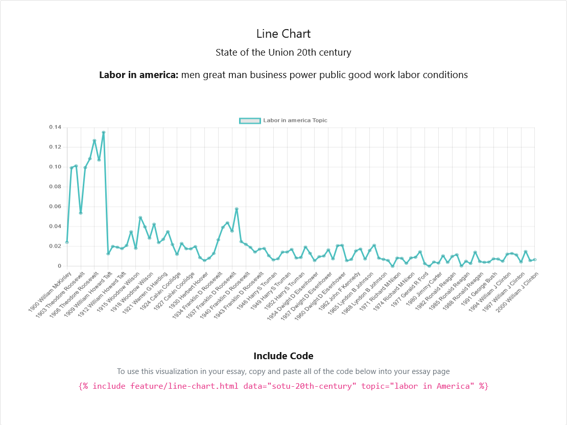
On the line graph, the x-axis represents each president’s speech and the year they gave it, while the y-axis communicates percentage (0.02 = 2%, 0.10 = 10%, and so on), and each point on the graph represents the percentage that the topic appears in a document. Hover over a point with your mouse to see what year and which speaker that point represents, as well as the percentage of the topic’s presence in that speech.
All of the line graphs work in this same manner, so scroll down the page to view the graph for each of the topics you’ve named.
- Do the topics peak/dip over time as you expect them to?
- Do you notice anything surprising about a particular topic?
- Are there any topics you’d like to rename?
Step 5. Include a Topic Visualization in Your Essay
-
From the “State of the Union 1900-2000” topics, select one topic’s graph that is especially interesting to you.
-
Look immediately underneath that graph, where you should see a section titled “Include Code” in bold, followed by a bracketed line of pink text, similar to this:
{% include feature/line-chart.html data="party-platforms-20th-century-all" topic="freedom and prosperity" %}
-
Copy the pink text (brackets and all) from under the topic graph and paste it two lines below the title in your
essay.mdfile. This pink text is called an “include” and is a handy way to add any topic graph into your multimedia essay, just as you have done with images and pdfs. -
Underneath the include that you just pasted into your
essay.mdfile, add two or three sentences that explain why this particular topic graph is interesting to you and/or relevant to your essay topic. -
Make sure to add a commit message and push the green “Commit changes” button to save your changes, then view the graph and your new sentences on the Essay In Progress page on your website (remember you’ll need to wait a few seconds and refresh the page to see your changes).
Need a visual? Follow along with the video below:
The steps above can seem complex when you’re working through them for the first time. If you’d like a visual demonstration of how to name topics, visualize them, and add a graph to your essay page, watch the video below: